Component Overview
This reusable Lightning Web Component (multiSelectPicklist) offers an enhanced picklist experience with advanced UI features. Designed for flexibility, it can be used in both Lightning App Builder and Experience Cloud.
- Supports both static and dynamic (Apex-fetched) picklist options
- Includes type-ahead search for quick filtering
- Displays selected values as removable chips
- Customizable design with responsive UI behavior
The component enables users to easily search, select, and manage multiple values with an intuitive dropdown interface. It supports both single and multi-select modes, making it ideal for forms, filters, and configuration screens.
Implementation Approach
This solution is built using a modular and scalable structure, divided into three key parts:
- LWC Component: Manages UI rendering, search logic, and selection handling
- Apex Controller: Retrieves picklist or custom values dynamically from Salesforce
- CSS Styling: Applies custom styles to dropdown, chips, and input field for a polished UX
LWC Component (HTML)
The template file defines the search input and selected values display:
<!-- multiSelectPicklist.html -->
<template>
    <template if:true={label}>
        <label class="slds-form-element__label">{label}</label>
    </template>
    <div class="slds-combobox_container">
        <div class="slds-combobox slds-dropdown-trigger slds-dropdown-trigger_click slds-is-open"
             aria-expanded="true" aria-haspopup="listbox" role="combobox">
            <!-- Search Input -->
            <div class="slds-combobox__form-element slds-input-has-icon slds-input-has-icon_right" role="none">
                <lightning-input disabled={disabled} class="inputBox"
                    placeholder="Select an Option"
                    onblur={blurEvent}
                    onclick={showOptions}
                    onkeyup={filterOptions}
                    value={searchString}
                    auto-complete="off"
                    variant="label-hidden"
                    id="combobox-id-1">
                </lightning-input>
                <lightning-icon class="slds-input__icon"
                    icon-name="utility:down"
                    size="x-small"
                    alternative-text="search">
                </lightning-icon>
            </div>
            <!-- Dropdown List -->
            <template if:true={showDropdown}>
                <div id="listbox-id-1" class="slds-dropdown slds-dropdown_length-5 slds-dropdown_fluid">
                    <ul class="slds-listbox slds-listbox_vertical recordListBox" role="presentation">
                        <template if:false={message}>
                            <template for:each={optionData} for:item="option">
                                <template if:true={option.isVisible}>
                                    <li key={option.value}
                                        data-id={option.value}
                                        data-label={option.label}
                                        onmousedown={selectItem}
                                        class="slds-listbox__item eachItem">
                                        <template if:true={option.selected}>
                                            <lightning-icon icon-name="utility:check"
                                                size="x-small"
                                                alternative-text="icon">
                                            </lightning-icon>
                                        </template>
                                        <span class="slds-media slds-listbox__option_entity verticalAlign slds-truncate">
                                            {option.label}
                                        </span>
                                    </li>
                                </template>
                            </template>
                        </template>
                        <template if:true={message}>
                            <li class="slds-listbox__item">
                                <span class="slds-media slds-listbox__option_entity verticalAlign slds-truncate">
                                    {message}
                                </span>
                            </li>
                        </template>
                    </ul>
                </div>
            </template>
        </div>
    </div>
</template>
LWC Component (JavaScript)
The controller handles business logic and user interactions:
// multiSelectPicklist.js
import { LightningElement, api, track } from 'lwc';

export default class MultiSelectSearchableComboBox extends LightningElement {
    @api options = [{ 'label': 'One', 'value': 'One' }, { 'label': 'Two', 'value': 'Two' }, { 'label': 'Three', 'value': 'Three' }, { 'label': 'Four', 'value': 'Four' }, { 'label': 'Five', 'value': 'Five' }];
    @api selectedValue;
    @api selectedValues = [];
    @api label;
    @api minChar = 1;
    @api disabled = false;
    @api multiSelect = false;
    @api isChild = false;
    @track value;
    @track values = [];
    @track optionData;
    @track searchString;
    @track message;
    @track showDropdown = false;

    constructor() {
        super();
        const style = document.createElement('style');
        style.innerText = `
        .inputBox input{
        background-color: rgb(255, 255, 255);
        border: 2px solid rgb(132 132 132);
        width: 100%;
        transition: border .1s linear, background-color .1s linear;
        display: inline-block;
        padding: 0 2rem 0 .75rem;
        line-height: 1.875rem;
        min-height: calc(1.875rem +(1px* 2));
        border-radius: 7px;
        }`;
       document.querySelector('head').appendChild(style);
    }

    connectedCallback() {
        this.showDropdown = false;
        var optionData = this.options ? (JSON.parse(JSON.stringify(this.options))) : null;
        var value = this.selectedValue ? (JSON.parse(JSON.stringify(this.selectedValue))) : null;
        var values = this.selectedValues ? (JSON.parse(JSON.stringify(this.selectedValues))) : null;
        if (value || values) {
            var searchString;
            var count = 0;
            for (var i = 0; i < optionData.length; i++) {
                if (this.multiSelect) {
                    if (values.includes(optionData[i].value)) {
                        optionData[i].selected = true;
                        count++;
                    }
                } else {
                    if (optionData[i].value == value) {
                        searchString = optionData[i].label;
                    }
                }
            }
            if (this.multiSelect)
                this.searchString = count + ' Option(s) Selected';
            else
                this.searchString = searchString;
        }
        this.value = value;
        this.values = values;
        this.optionData = optionData;
    }

    filterOptions(event) {
        this.searchString = event.target.value;
        if (this.searchString && this.searchString.length > 0) {
            this.message = '';
            if (this.searchString.length > 0) {
                var flag = true;
                for (var i = 0; i < this.optionData.length; i++) {
                    if (this.optionData[i].label.toLowerCase().trim().includes(this.searchString.toLowerCase().trim())) {
                        this.optionData[i].isVisible = true;
                        flag = false;
                    } else {
                        this.optionData[i].isVisible = false;
                    }
                }
                if (flag) {
                    this.message = "No results found for '" + this.searchString + "'";
                }
            }
            this.showDropdown = true;
        } else {
            this.showOptions();
        }
    }

    selectItem(event) {
        console.log('valList', this.showDropdown)
        var selectedVal = event.currentTarget.dataset.id;
        var selectedLabel = event.currentTarget.dataset.label;
        let valList = this.values.filter(vendor => vendor === selectedVal)
        console.log('values', JSON.stringify(this.values))
        console.log('valList', JSON.stringify(valList))
        if (!this.isChild && this.values.length == 10 && valList.length == 0) {
            return;
        }
        if (selectedVal) {
            var count = 0;
            var options = JSON.parse(JSON.stringify(this.optionData));
            for (var i = 0; i < options.length; i++) {
                if (options[i].value === selectedVal) {
                    if (this.multiSelect) {
                        if (this.values.includes(options[i].value)) {
                            this.values.splice(this.values.indexOf(options[i].value), 1);
                        } else {
                            this.values.push(options[i].value);
                        }
                        options[i].selected = options[i].selected ? false : true;
                    } else {
                        this.value = options[i].value;
                        this.searchString = options[i].label;
                    }
                }
                if (options[i].selected) {
                    count++;
                }
            }
            this.optionData = options;
            if (this.multiSelect)
                this.searchString = count + ' Option(s) Selected';
            if (this.multiSelect)
                event.preventDefault();
            else
                this.showDropdown = false;
        }

        this.dispatchEvent(new CustomEvent('select', {
            detail: {
                'selected': {
                    'value': selectedVal,
                    'label': selectedLabel
                }
            }
        }));
    }

    showOptions() {
        if (this.disabled == false && this.options) {
            this.message = '';
            this.searchString = '';
            var options = JSON.parse(JSON.stringify(this.optionData));
            for (var i = 0; i < options.length; i++) {
                options[i].isVisible = true;
            }
            if (options.length > 0) {
                this.showDropdown = true;
            }
            this.optionData = options;
        }
    }

    removePill(event) {
        var value = event.currentTarget.name;
        var count = 0;
        var options = JSON.parse(JSON.stringify(this.optionData));
        for (var i = 0; i < options.length; i++) {
            if (options[i].value === value) {
                options[i].selected = false;
                this.values.splice(this.values.indexOf(options[i].value), 1);
            }
            if (options[i].selected) {
                count++;
            }
        }
        this.optionData = options;
        if (this.multiSelect)
            this.searchString = count + ' Option(s) Selected';
    }

    blurEvent() {
        var previousLabel;
        var count = 0;
        for (var i = 0; i < this.optionData.length; i++) {
            if (this.optionData[i].value === this.value) {
                previousLabel = this.optionData[i].label;
            }
            if (this.optionData[i].selected) {
                count++;
            }
        }
        if (this.multiSelect)
            this.searchString = count + ' Option(s) Selected';
        else
            this.searchString = previousLabel;

        this.showDropdown = false;
    }
}/* multiSelectPicklist.css */
.verticalAlign {
cursor: pointer;
padding: 0px 5px !important;
}
.slds-dropdown {
padding: 0px !important;
}
.recordListBox {
margin-top: 0px !important;
overflow-y: scroll;
}
.slds-listbox li {
padding: .45rem 0.7rem !important;
display: flex;
}
.inputBox input {
padding-left: 10px;
}
.eachItem:hover {
background-color: #F1F1F1;
cursor: pointer;
}
/* Custom Scrollbar Styling */
::-webkit-scrollbar {
width: 7px;
height: 7px;
}
::-webkit-scrollbar-track {
display: none !important;
}
::-webkit-scrollbar-thumb {
border-radius: 10px;
background: rgba(0, 0, 0, 0.4);
}Parent Compnent
Call the coponent and Pass the value to use picklist :
<!-- parentComponent.html -->
<template>
    <lightning-card>
        <c-multi-select-searchable-combo-box
            if:true={isChild}
            options={options}
            multi-select={multiSelect}
            is-child={isChild}
            onselect={selectEvent}>
        </c-multi-select-searchable-combo-box>

        {SelectedVluaes}
    </lightning-card>
</template>// multiSelectParent.js
import { LightningElement, track } from 'lwc';
export default class MultiSelectParent extends LightningElement {
multiSelect = true;
isChild = true;
@track options = [
{'label':'One','value':'One'},
{'label':'Two','value':'Two'},
{'label':'Three','value':'Three'},
{'label':'Four','value':'Four'},
{'label':'Five','value':'Five'},
{'label':'Six','value':'Six'},
{'label':'Seven','value':'Seven'},
{'label':'Eight','value':'Eight'},
{'label':'Nine','value':'Nine'},
{'label':'Ten','value':'Ten'},
{'label':'Eleven','value':'Eleven'},
{'label':'Twelve','value':'Twelve'},
{'label':'Thirteen','value':'Thirteen'},
{'label':'Fourteen','value':'Fourteen'},
{'label':'Fifteen','value':'Fifteen'},
{'label':'Sixteen','value':'Sixteen'},
{'label':'Seventeen','value':'Seventeen'},
{'label':'Eighteen','value':'Eighteen'},
{'label':'Nineteen','value':'Nineteen'},
{'label':'Twenty','value':'Twenty'}
];
handleClick() {
// Handle click event if needed
}
selectEvent(event) {
console.log(event.detail);
}
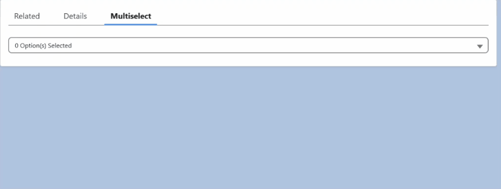
}Component in Action
Conclusion
This custom multi-select picklist component offers:
- Reusability: Easily adaptable to any standard or custom picklist field
- Performance: Supports caching for faster loading and reduced server calls
- User Experience: Aligned with native Lightning UI patterns for consistency
To implement this component, simply include it in your LWC templates and pass the required objectApiName and fieldApiName as attributes. It’s a plug-and-play solution for modern, interactive Salesforce UIs.